|
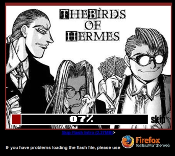
Welcome to Exhibit B: The Hellsing Project. The authors of this eLiterature take the pen names of Sword Dancer, OutRage, and 4th Gen Tzimisce, or otherwise as the collaborative group "The Birds of Hermes." We will refer to them as BoH for simplicity's sake for the rest of this exhibit. As you enter this eLiterary work, you will first be greeted by a flash animation. Web authors more skilled than I create animations utilizing programs, in which they either fully create their own new works or use a collage of sorts to give older materials new life. Flash animations also tend to have sound layered into the feature to add to the readers' overall experience. For slower connections, some flash animators are even kind enough to add a preloader to give your computer enough time to download the full flash animation for better viewing, as shown in the clip to your left.
|
|
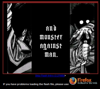
The flash animation BoH presents you with would be that of the latter type. Using scans from the popular manga "Hellsing," BoH created a flash animation that introduces the reader to the story and characters of the manga. While it would nearly be impossible for me to capture the full affect of BoH's flash animation in a mere screen shot, the clip to your right shows one particular scene in which images of two characters are pasted together with the text "and monster against man." It would take far too much space to explain the meaning of this particular clip, but notice the use of visibility in this clip. Much of the flash animation follows through with the quality of visibility. The readers unfamiliar with the "Hellsing" manga will immediately get the image that the story details a veritable war between non-human creatures, the Church, and a radical group.
|
|
|
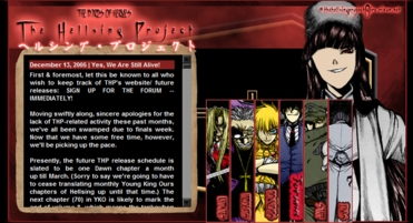
After the reader has finished viewing the flash animation, s/he can follow the plain text link into the website. The reader is presented with the layout as shown in the image to your left. In the top left corner of the layout, one finds the collaborative group name, the title of the piece, along with Japanese kanji that serves either as an aesthetic for non-Japanese readers or as an accent to those readers familiar with kanji characters. Below this information, a textbox with news and update information appears as the default. We have found an instance of simplicity on the left side of the layout: the work title, authors, and information are all easily accessible and legible to the reader upon entering the website. Moving to the right of the layout, we find a more graphical approach used.
|